Exploring Intentional Camera Movement in Photography

Prior to encountering intentional camera movement (ICM), the idea of painting with our camera, a tool primarily intended for capturing crisp images, had never crossed my mind. A photograph lacking crispness could be perceived as the work of an amateur photographer who has yet to master fundamental photography techniques. To many, it appears that only painters possess the liberty to maneuver their paintbrushes in portraying the motion of leaves, capturing the essence of the wind’s presence. Now, with the ICM technique, photographers also possess the means to depict the movement of elements within their photographs.

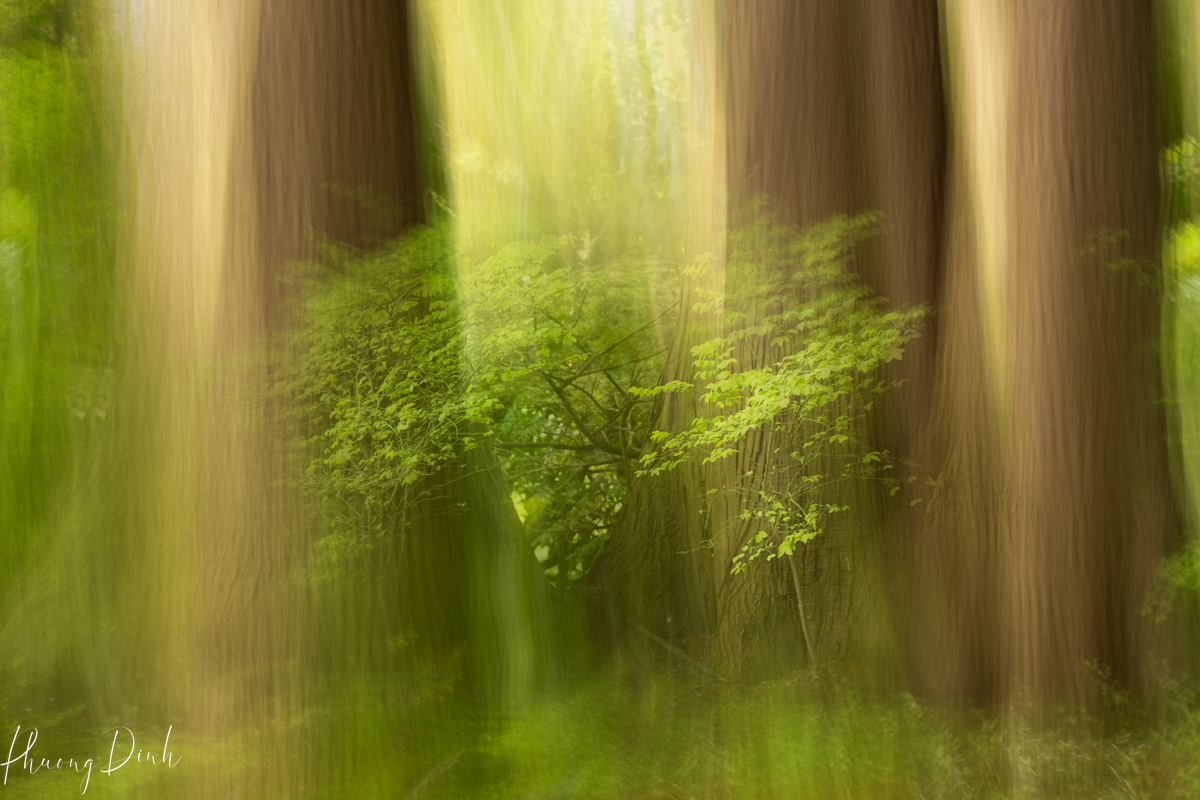
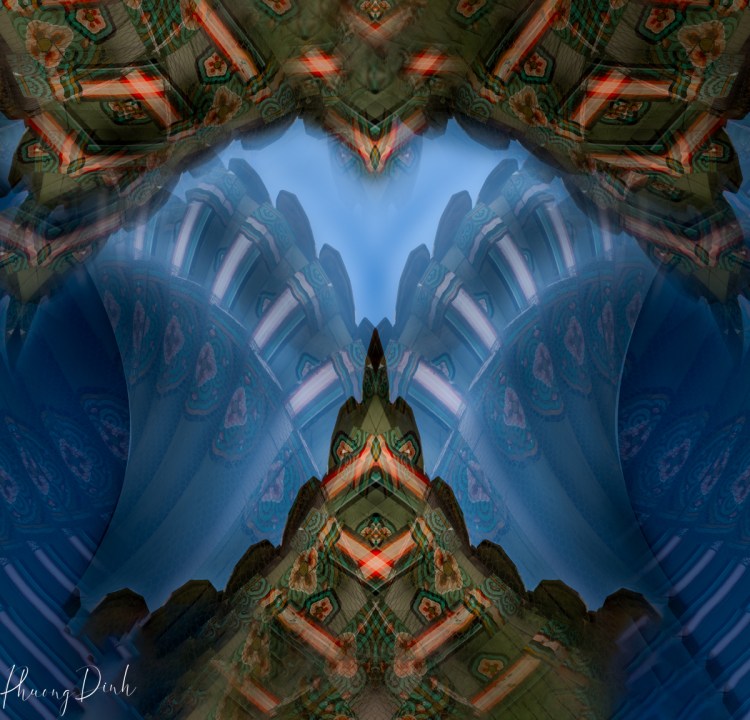
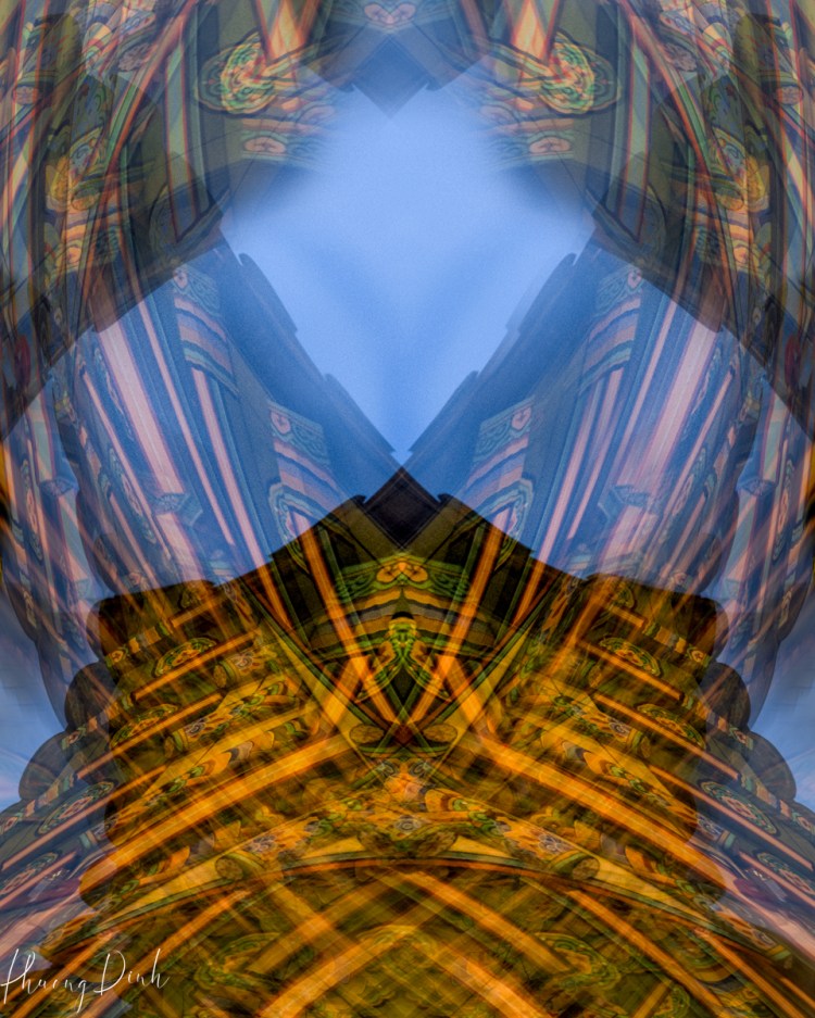
In ICM photography, blur is not a flaw; it is a deliberate choice. By intentionally blurring elements within the frame, photographers can convey a sense of motion, energy, and abstraction. This departure from sharpness allows for the creation of ethereal, dream-like images that engage the viewer’s imagination and convey the photographer’s emotions.

Mastering ICM was not without its trials. My early experiments were chaotic, often resulting in images that were less art and more accident. Yet, with every shutter release, I learned. Slow shutter speeds, typically ranging from a few seconds to several seconds, became my best friend, allowing me to stretch a moment into eternity. However, the optimal shutter speed varies depending on factors such as the speed of movement, lighting conditions, and desired effect.

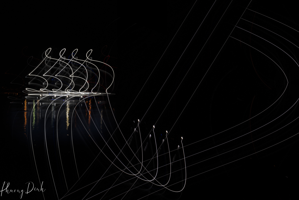
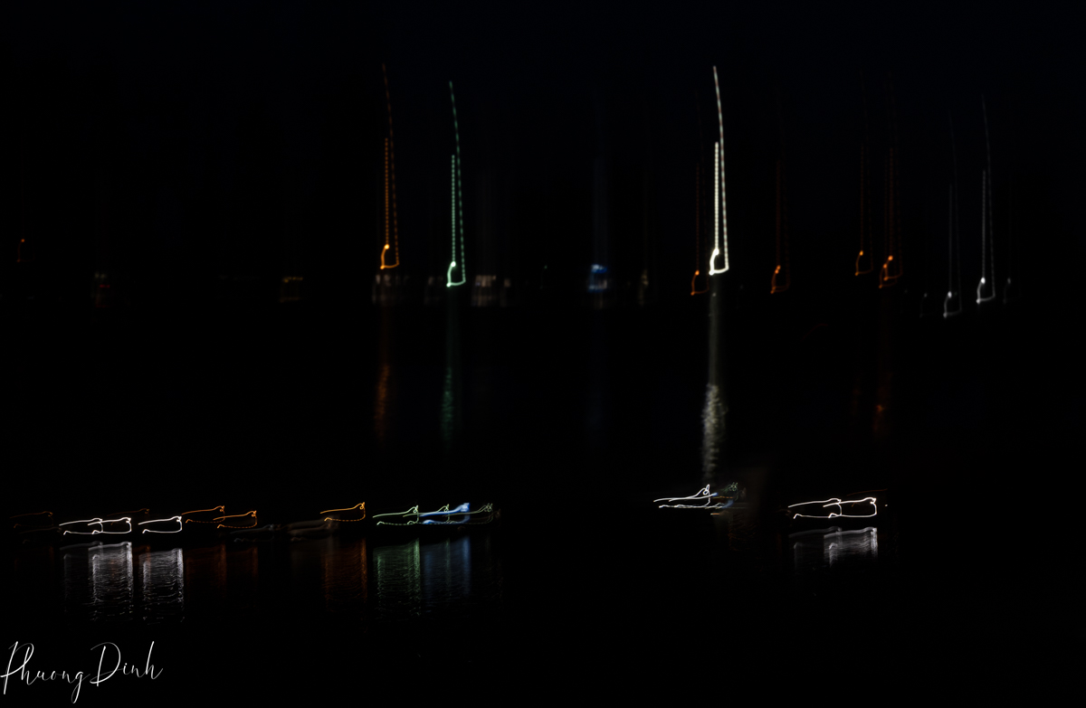
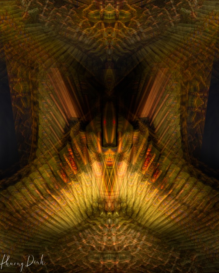
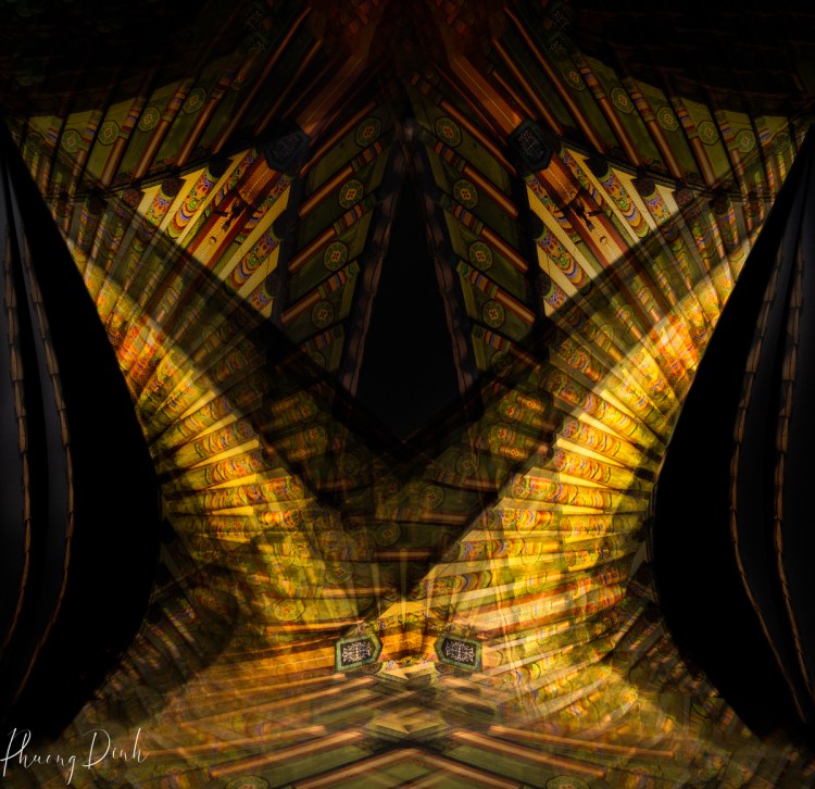
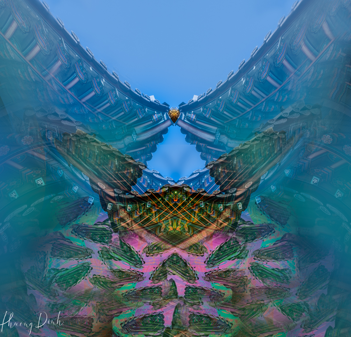
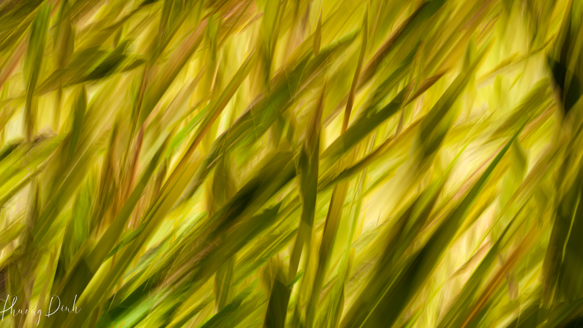
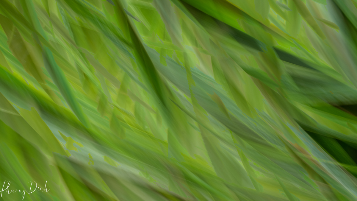
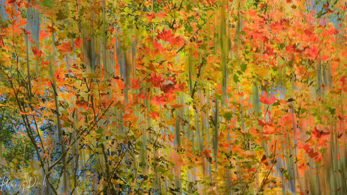
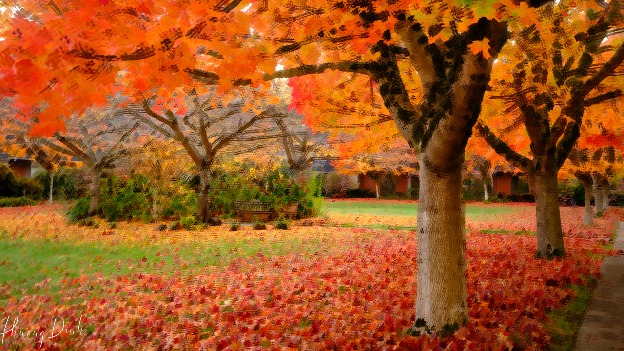
I played with movements—horizontal sweeps over cityscapes turned buildings into waves of light, while vertical lifts in a forest transformed trees into a vortex of colors. The direction and intensity of camera movement greatly influence the final result. Horizontal or vertical panning, spiraling motions, or random movements can all yield distinct effects. The key is to experiment with different movements to see how they interact with the subject and the scene.

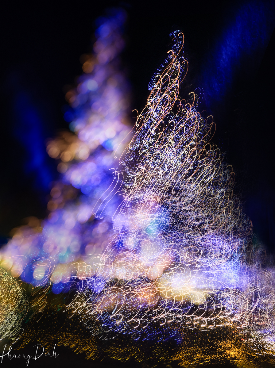
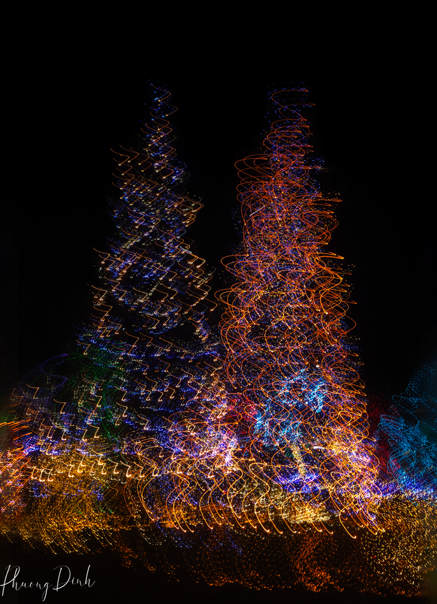
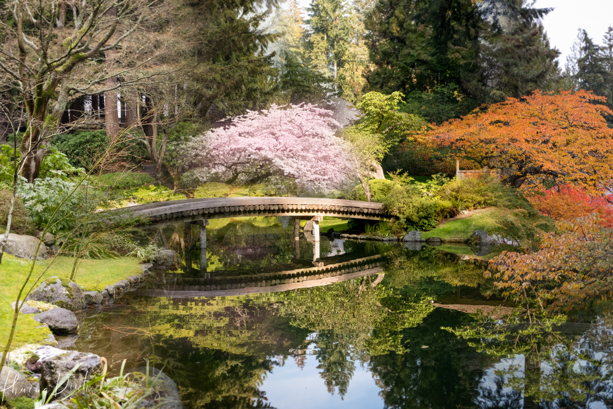
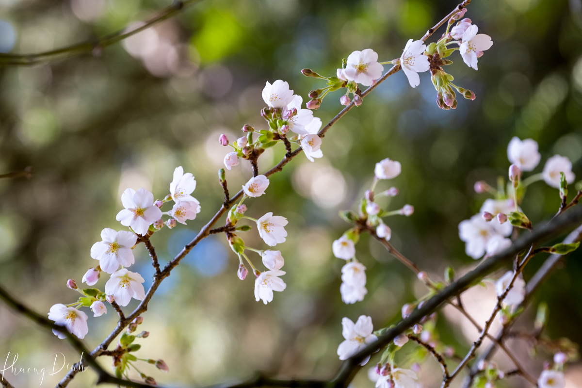
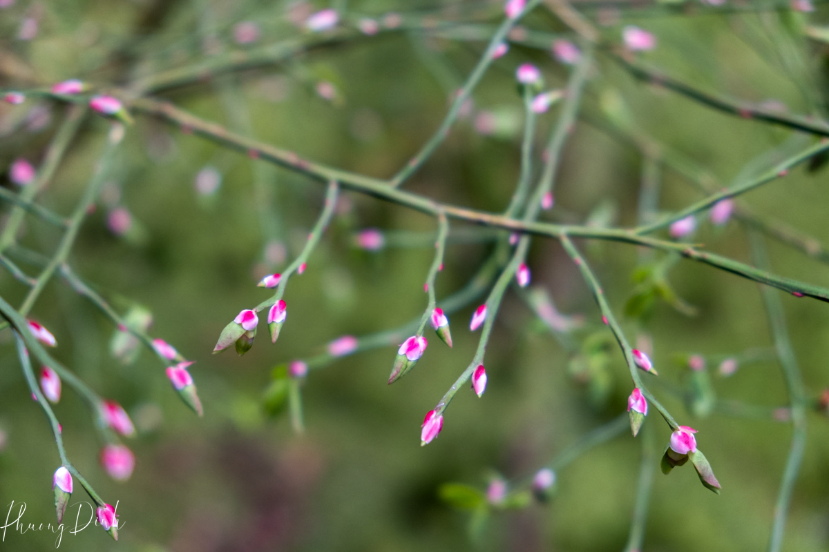
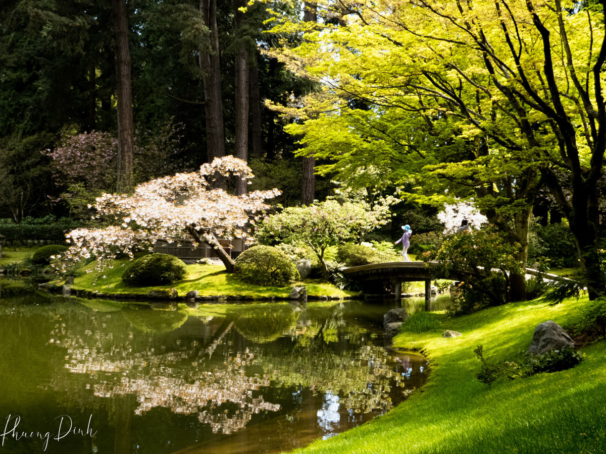
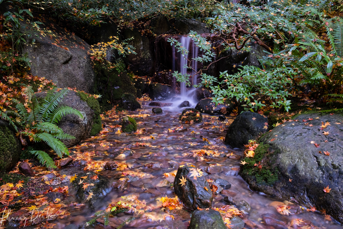
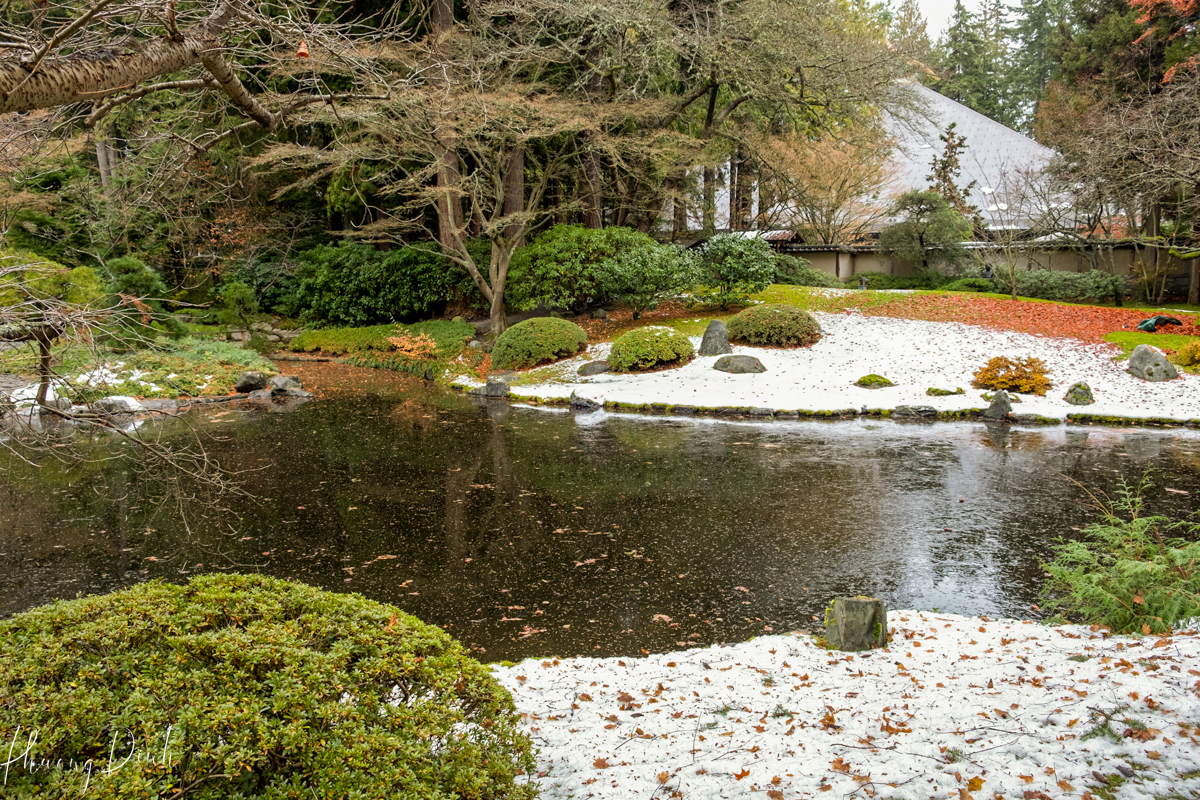
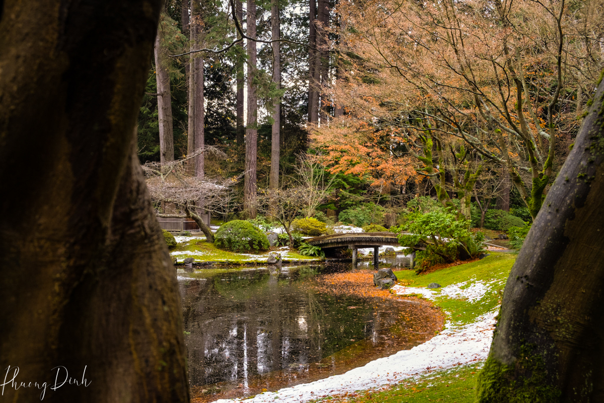
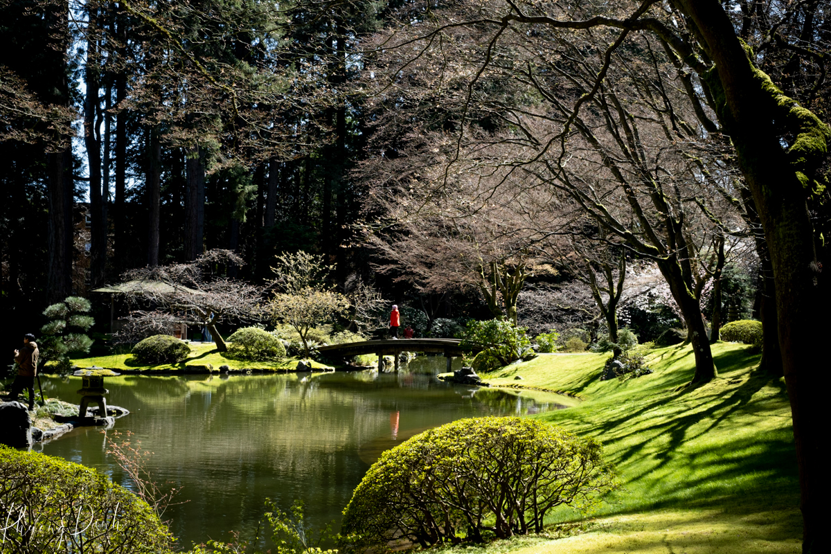
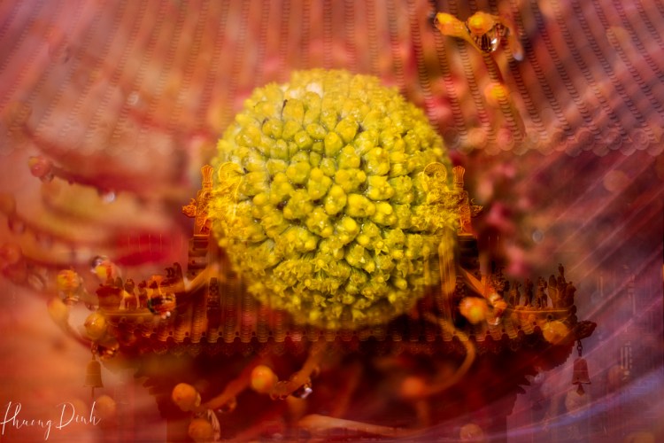
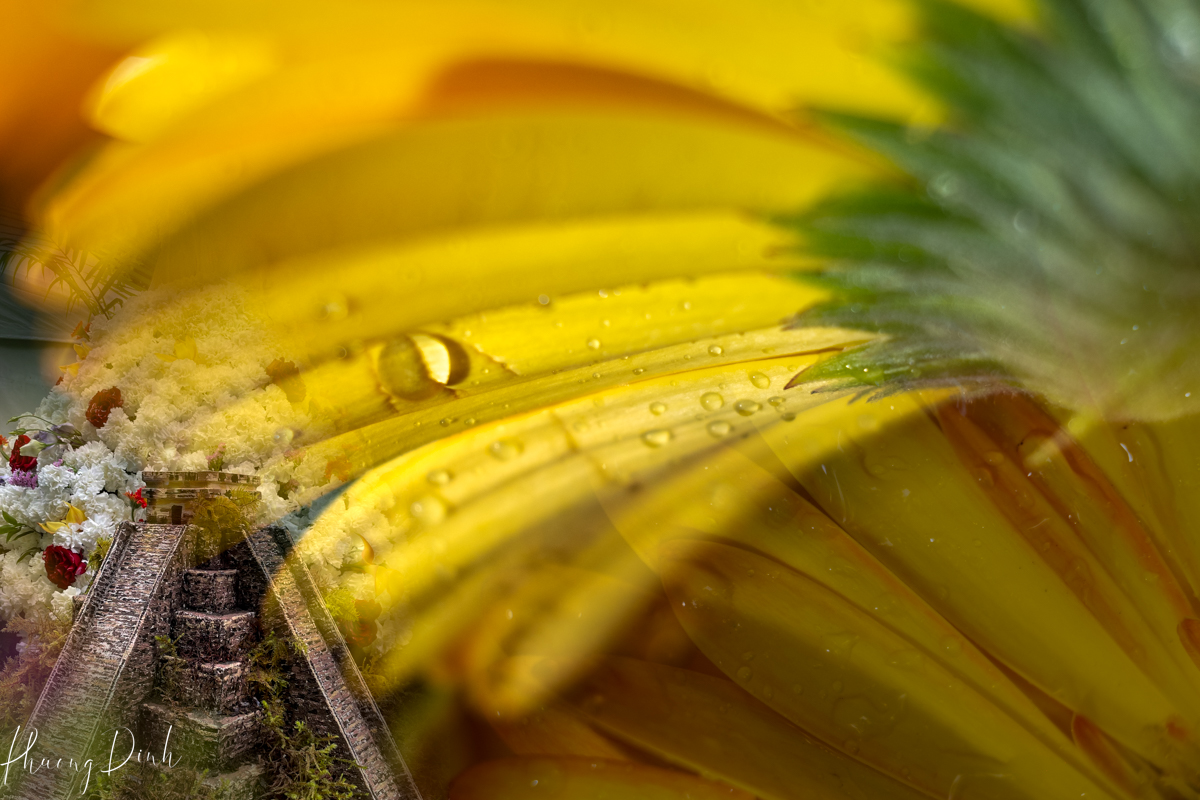
The subjects I most enjoy capturing with ICM are flowers, trees, leaves, and grass. Inspiration for ICM photography can be found everywhere, from bustling city streets to tranquil natural landscapes. Elements that lend themselves to dynamic motion, such as flowing water, swaying trees, or moving crowds are also well-suited candidates for the ICM technique.

What ICM taught me was the beauty of imperfection. In a world obsessed with clarity and sharpness, choosing to blur the lines (quite literally) felt like an act of defiance. Each image I created was unique, impossible to replicate exactly—a fleeting impression of a moment as I saw it, felt it.

The journey into ICM has been more than just a photographic exploration; it is been a voyage into the heart of what it means to truly see. In the blurred lines and swathes of color, I found my voice—a voice that cherishes the imperfect, the ephemeral, the emotional landscape of our lives.

My exploration of ICM is far from over; it feels as though I have barely scratched the surface. Yet, I am eager to share this journey, to show that in the embrace of motion and the acceptance of imperfection, there lies a profound beauty. To those just starting, I say: let go of the conventional, embrace the unexpected, and allow the dance of light and movement to guide you.

ICM has transformed not just how I photograph, but how I view the world—no longer as a series of still frames, but as a continuous flow of moments and emotions, each more fleeting and beautiful than the last. In the blur, I have found my clarity.


Subscribe to stay informed about blog updates and new print releases. All email addresses are kept strictly confidential and will not be disclosed to third parties.

© 2023 Copyright Phuong Dinh. All rights reserved.

Transform Your Artwork: Framing Guide

Moving to a new place often brings with it the opportunity to rediscover treasures hidden away in boxes and storage. As I unpacked my belongings in my new home, I found myself sifting through my paintings archive, each canvas holding memories and emotions from years past. Amongst them were pieces that I had created but never had the chance to frame and display. The sight of these forgotten artworks sparked a newfound desire to give them the attention they deserved – to frame them and let them breathe life into the walls of my new abode.

Framing your own artwork is more than just a practical task; it’s a journey of reconnecting with your creativity and giving your creations the recognition they deserve. It’s about transforming a mere canvas into a piece of art that can be proudly showcased and admired.

I opted for a hand-held Made-in-Japan NT Professional Mat Cutter, which I bought from Amazon, instead of dealing with a cumbersome large mat cutter. Essentially, you will require a cutting mat, a mat cutter, a ruler, uncut mat boards, and artistic tapes to get started.

The process begins with selecting the right frame and matting, considering factors such as the style of the artwork, the décor of the space it will inhabit, and personal preferences. This decision is crucial, as the frame and matting serve not only to enhance the artwork but also to protect it from environmental factors. Typically, I opt for white or black mat boards for the majority of my artwork. Occasionally, I will select colored mat boards to complement the theme of my paintings.

For those located in Vancouver, finding quality mat board is essential for your framing endeavors. My preferred destination for art supplies has always been the Opus Art Supplies store in my neighborhood. Opus provides an extensive selection of mat boards at very reasonable prices. Additionally, you may also explore other options such as Michaels and DeSerres in your neighborhoods.

Once the materials are chosen, the next step is to carefully measure and cut the mat board to fit the dimensions of the artwork. Precision is key here, as even the slightest deviation can affect the overall presentation. This is where tools like the NT Professional Mat Cutter come into play, ensuring clean and accurate cuts with ease. Sketch the dimensions of the opening on the back of the mat board. Align the cutting marks on the cutter with these lines. I recommend firmly holding the ruler in place and moving the cutter slowly along the cutting lines.

It’s essential to practice and familiarize yourself with its operation to achieve clean and precise cuts when framing a mat.

Usually, I opt to temporarily attach the painting to the mat board. This method enables me to flip the front board over and substitute the painting as necessary. For this purpose, I employ Tyvek Tape as a hinge between the cut mat and the backboard. I then use artistic tape on the photo corners to affix a photo to a mat, creating a T shape with the tape by overlapping the adhesive sides.

As the pieces come together – the artwork snugly encased within its frame, the matting providing a polished border – there is a sense of fulfillment that accompanies the process. It is a tangible manifestation of creativity and craftsmanship, a testament to the journey that each artwork represents.

oil painting, oil pastel, pastel painting, painting, drawing, craft, artwork, art, fine art, flower, poppy, poppies

But framing your own artwork is not just about the end result; it is about the journey itself – the memories and emotions that resurface as you handle each piece, the satisfaction of bringing something old back to life in a new context. It is a celebration of creativity and self-expression, a reminder of the beauty that lies within our own creations.

So, as I hang these newly framed artworks on the walls of my new home, I am reminded not only of the journey that brought me here but also of the journey that each painting represents. And as I continue to create and evolve as an art lover, I know that these framed pieces will serve as a reminder of where I have been and a source of inspiration for where I am headed.


Subscribe to stay informed about blog updates and new print releases. All email addresses are kept strictly confidential and will not be disclosed to third parties.

© 2023 Copyright Phuong Dinh. All rights reserved.

Discovering Nitobe Memorial Garden: A Seasonal Journey

Vancouver, British Columbia, Canada

As I step into Nitobe Memorial Garden, I am enveloped in a sense of tranquility that washes over me like a familiar embrace. Nestled within the University of British Columbia in the vibrant city of Vancouver, this Japanese garden serves as a sanctuary of peace and serenity, a place where time seems to stand still amidst the ever-changing seasons.

Having lived in Japan for many years, Nitobe Garden holds a special place in my heart. Every visit feels like coming home, a return to the beauty and harmony of Japanese landscapes. Over the past year, I have embarked on a journey to capture the essence of this garden through the lens of my camera, witnessing its transformation with each passing season.

As the cherry blossoms burst into bloom, Nitobe Garden awakens from its winter slumber with a burst of color and vitality. The delicate petals of the sakura trees dance in the gentle breeze, casting a dream-like hue over the tranquil ponds and winding pathways.


Vibrant azaleas and irises add splashes of pink and purple, while the fresh greenery of newly budded leaves brings a sense of renewal to the landscape. It is a season of new beginnings, where every corner of the garden is adorned with the promise of life and growth.

As the days grow longer and the sun bathes the garden in its warm embrace, Nitobe Garden transforms into a lush oasis of greenery. Bushes sway gently, casting speckled patterns of shade over meandering streams, while meticulously trimmed foliage fosters a serene equilibrium.

Lively green maple leaves grace the calm ponds, their verdant hues unfolding akin to masterpieces amidst the lush greenery. This is a season brimming with richness and vigor, where vitality pulsates through every inch of the garden’s expanse.

As the air grows crisp and the leaves begin to turn, Nitobe Garden is bathed in a kaleidoscope of autumnal hues. The fiery reds and oranges of maple trees mingle with the golden yellows of ginkgos, creating a breathtaking tapestry of color that stretches as far as the eye can see.


The gentle rustle of fallen leaves underfoot serves as a reminder of the fleeting nature of beauty, urging visitors to savor every moment of this ephemeral season. It is a time of reflection and introspection, where the changing landscape mirrors the cyclical nature of life itself.

Nitobe Garden falls into a hushed silence, punctuated only by the occasional chirp of a bird or the soft trickle of water from the frozen ponds, as snow blankets the garden in a soft, white embrace.

The stark beauty of bare branches and snow-covered landscapes lends a sense of purity and simplicity to the surroundings, inviting visitors to pause and reflect on the quiet beauty of the season. It is a time of stillness and solitude, where the garden seems to exist in a state of suspended animation, waiting patiently for the arrival of spring.

As I reflect on my year spent photographing Nitobe Memorial Garden, I am struck by the profound beauty and harmony that permeates every season. Each visit feels like a homecoming, a return to a place of timeless tranquility and serenity.

And as the garden continues to change and evolve with the passing of time, I am reminded of the fleeting nature of beauty and the importance of cherishing each moment, for it is in these quiet corners of the world that we find solace and peace amidst the chaos of everyday life.

View my slideshow of Nitobe Memorial Garden in four seasons here.


Subscribe to stay informed about blog updates and new print releases. All email addresses are kept strictly confidential and will not be disclosed to third parties.

© 2023 Copyright Phuong Dinh. All rights reserved.

Transforming Architecture into Fashion: Korean Palace Inspirations

One thing I love doing when traveling to a new country is visiting the ancient towns, traditional palaces, and old and new buildings. As architecture and culture are interdependent and inseparable, architecture is part of the identity of each community and carries the message of the culture of that society. Exploring architecture is a great way to learn about their history, culture, and social values.

This series of six images are created from photographs of different “gaewa” – traditional Korean palace roof – taken at five royal palaces located at the heart of Seoul during my recent trip to Korea. I was fascinated by the unique and bright multi-colored decorative painting beneath the roofs. Strong red and blue-green colors are used in harmony with yellow, black, and white, which makes these roofs stand out and absolutely stunning when they are illuminated at night. The use of five colors reflects the yin and yang principle and the five elements of fire, water, wood, metal, and earth. The painting not only had a decorative function but also a protective purpose, preserving the building’s wood from rotting due to wind, rain, and vermin. The vibrant and bright colors were also believed to protect the buildings from evil spirits and emphasize the authority of its resident.

With many curved lines from tree trunks to waves, nature is traditionally considered as model for architecture, items, and even clothing in many Asian countries including Korea. Therefore, in traditional architecture and clothing, curved lines are clearly visible. Most of the roofs at these royal palaces have slightly raised edges whose purpose is to let in sunlight in winter and protect the interior from the summer sun. The roof curves inwards to prevent rainwater from being trapped or the tiles from slipping off. In addition to naturally curved lines, national symbols, and patterns of flowers and animals are also widely incorporated in Asian traditional buildings. As for clothing, curving lines are also found in the collars, underneath the sleeves of the upper garment, and skirt-like undergarments resulting from movement in Korean traditional clothing.

When wandering in these 14th-century built palaces, I was imagining what life was like 600 years ago. What kind of activities were held? How food was cooked and served? How dances and music were performed? Especially, how people dressed at that time. When going through all photographs taken during that trip a couple of months later, my mind started wandering again. The decoratively multi-colored painted roofs look like a piece of fabric to me. I wondered if the same symbols, decorative motifs, and patterns were also traditionally used on fabrics. I asked myself what it would look like if I make dresses from these beautiful “fabrics” floating on my computer screen. I was not creating clothing that looks exactly like Korean traditional Hanbok, but rather letting my imagination flow freely as I was putting pieces of fabric together. I tried to replicate the natural curves, shapes, and lines while accentuating the raised edges and inward curves in order to transform the rigid wooden roof into a delicate, gracious, and fluid dress.

Basic techniques in Photoshop such as duplicating, transforming, and flipping the image horizontally and vertically were used as tape measure, seam ripper, thread, scissors, and sewing needles to put together six dresses for different occasions. In the end, curve adjustment was used to enhance light and shadow in order to define the final shape of the dresses. Each “dress” is created from only one image of a particular roof. All the inner-wear, overcoat, and accessories were created from the decorations on the same roof used to create that dress. To me, this series of images is a short movie of a royal life that reappeared through my imaginative dresses.


Subscribe to stay informed about blog updates and new print releases. All email addresses are kept strictly confidential and will not be disclosed to third parties.

© 2023 Copyright Phuong Dinh. All rights reserved.

Floral Inspiration: Fleurs de Villes at VanDusen Garden

VanDusen Botanical Garden – Vancouver, British Columbia, Canada

Flowers have always been my inspiration since I was a kid. I enjoyed drawing flowers since I was nine or ten. Today, painting flowers with my camera brings me joy, happiness, and fulfillment. Since moving to Vancouver, I found that there are so much more opportunities to enjoy the beauty of nature in bloom here. Vancouver is spectacular in spring with a very long blooming season and equally beautiful throughout the summer. Places with different kinds of flowers in full bloom are all around us. I am photographing flowers almost everywhere, from my backyard, small gardens in my neighborhood, and nursery to family-run flower farms. Among other great places in town, VanDusen Botanical Garden is my number one favorite place to enjoy the serene combination of chirping birds and blooming flowers.

This year, the fun is many times multiplied when the fresh floral journey – Fleurs de Villes – took place at VanDusen. Fleurs de Villes is an annual floral event where floral artists from different cities put together their creative fresh floral mannequins and spectacular installations to showcase iconic global destinations. The installations are the results of inspirations from timeless monuments such as the Eiffel Tower, Statue of Liberty, and Leaning Tower of Pisa, as well as the diverse traditions, festivals, fashion, and notable people from cities around the world. Being part of the event is a great way to learn about different cultures and traditions, and boost our creativity through our love for flowers.

This series of ten images ere created from photographs I took during my visit to the floral trail at Fleurs de Villes Voyage this year. Each final image was created by putting together two or more macro shots of flowers and decorations from the floral mannequins representing the cultures, people, and heritage of each destination. I chose to combine the representative flowers of each destination with its renowned landmark to tell a story about that particular place. Some are created with multiple exposures, while some are put together in Photoshop. It might just be my own thoughts and feelings about these destinations, and not necessarily how people think about those places in general.

I hope you had a chance to visit Fleurs de Villes Voyage at VanDusen Botanical Garden yourself. If you have not, I hope you will enjoy walking through this floral trail created from my inspiration and artistic vision.

China – Dragon and Gates

The representative flower is a pincushion. With its bright and vibrant yellow or orange colors, the pincushion is a unique, modern, and long-lasting tropical variety of flowers. This, in my opinion, well represents China for its culture – one of the world’s oldest cultures – originating thousands of years ago and the state of modern China today. All of which makes China a unique country as we know it today.

Egypt

Many of us love roses for their delicacy, elegance, beauty, and gentle fragrance. The soft and pink hue represents a powerful symbol of love, romance, and beauty in the story of the Egyptian goddesses dating back to ancient times. In Ancient Egypt, rose petals can be found in many paintings. Roses were also cherished by Cleopatra VII, who used roses and fragrances during her public appearances, which ultimately increased their popularity throughout the country. There is no other flower associated better with ancient Egypt – a land of mysteries – than roses.

Hawai’i

Although the flamingo lily is naturally found in tropical rainforests in South America, it is usually associated with Hawai’i. The islands are massive exporters of this aroid houseplant for many years. Its bright heart-shaped leaves carry the symbolic meaning associated with abundance, hospitality, love, and luck. I combined flamingo lily and Hawaiian white plumeria to celebrate its “aloha” spirit.

Italy

The calla lily is often used at weddings in Italy, especially for wedding decorations and bridal bouquets, for its romantic elegance, feminine aspect, and purity. This year, calla lilies, roses, and daisies are used to decorate the Italy Mannequin – the Leaning Tower of Pisa. This combination effectively represents the beauty, joy, cheerfulness, and passion that can often be found in Italy.

Paris, France

The fleur-de-lis, or “sweet iris” has been used by the ancient royal family of France as their emblem for centuries. In a religious sense, the three petals of the iris symbolize the trinity, while in modern France, the flower represents pureness, brightness, solemnity, hope, and freedom. Fleur-de-lis literally means “lily”, for which the lily flower is also believed to be the national flower of France. The combination of purple iris and pink lily represents the myth of France’s national flower.

England

I chose to combine rose and red carnations for England. The dark red carnation expresses sincere love and affection, while the rose represents peace, unity, and harmony. The final image results from a combination of layers of the popular classic red telephone booth, Big Ben Parliament Tower, and London red city bus, which are easily found in the Westminster area.

Mexico

Yellow is the color of happiness and optimism. Yellow is also a cheerful and energetic color that brings joy and fun to the world. I combined yellow sunflowers and Mexico’s most notable pyramid to celebrate its vibrant culture and rich ancient history, as well as the charming, courteous, and polite people of Mexico.

Santorini, Greece

White roses and blue larkspurs are used to celebrate the iconic colors in Greece, especially Santorini. They are also the colors of the country’s flag. They certainly represent the colors of the bright sea and sky synonymous with the beautiful Mediterranean.

Spain

Spain has a vibrant and warm culture. The people are passionate, energetic, expressive, and loving. They are highly motivated when celebrating traditional festivities and proud of their artistic, historic, and cultural heritage. Red roses and a flamenco dancing figure are intertwined to celebrate the energy, strength, passion, and the country’s complex art form designated as World Intangible Cultural Heritage.

Stanley Park, Vancouver

Vancouver is known for its scenic views, mild climate, diverse culture, and friendly people. Vancouver is also home to many vibrant and interesting places, including Coal Harbor, Granville Island, Kitsilano, Commercial Drive, Yaletown, and Chinatown, just to name a few. This year, Vancouver’s iconic Stanley Park is beautifully and energetically featured at Fleurs de Villes Voyage to showcase the natural beauty, energy, diversity, liveliness, and popularity of Vancouver.


Subscribe to stay informed about blog updates and new print releases. All email addresses are kept strictly confidential and will not be disclosed to third parties.

© 2023 Copyright Phuong Dinh. All rights reserved.